Posted by AGORACOM
at 2:07 PM on Tuesday, January 28th, 2020
SPONSOR: American Creek owns a 20% Carried Interest to Production at the Treaty Creek Project in the Golden Triangle. 2019’s first hole averaged of 0.683 g/t Au over 780m in a vertical intercept. The Treaty Creek property is located in the same hydrothermal system as the Pretivm and Seabridge’s KSM deposits. Click Here For More Info
Excerpts from Crescat Capital November Newsletter:
Precious Metals
Precious metals are poised to benefit from what we consider to be the
best macro set up we’ve seen in our careers. The stars are all
aligning. We believe strongly that this time monetary policy will come
at a cost. Look in the chart below at how the new wave of global money
printing just initiated by the Fed in response to the Treasury market
funding crisis is highly likely to pull depressed gold prices up with
it.
The imbalance between historically depressed commodity prices
relative to record overvalued US stocks remains at the core of our macro
views. On the long side, we believe strongly commodities offer
tremendous upside potential on many fronts. Precious metals remain our
favorite. We view gold as the ultimate haven asset to likely outperform
in an environment of either a downturn in the business cycle, rising
global currency wars, implosion of fiat currencies backed by record
indebted government, or even a full-blown inflationary set up. These
scenarios are all possible. Our base case is that governments and
central banks will keep their pedals to the metal to attempt to fend off
credit implosion or to mop up after one has already occurred until
inflation becomes a persistent problem.
The gold and silver mining industry is precisely where we see one of
the greatest ways to express this investment thesis. These stocks have
been in a severe bear market from 2011 to 2015 and have been formed a
strong base over the last four years. They are offer and incredibly
attractive deep-value opportunity and appear to be just starting to
break out this year. We have done a deep dive in this sector and met
with over 40 different management teams this year. Combining that work
with our proprietary equity models, we are finding some of the greatest
free-cash-flow growth and value opportunities in the market today
unrivaled by any other industry. We have also found undervalued
high-quality exploration assets that will make excellent buyout
candidates.
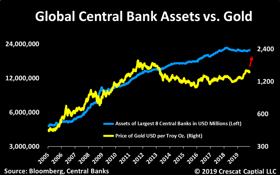
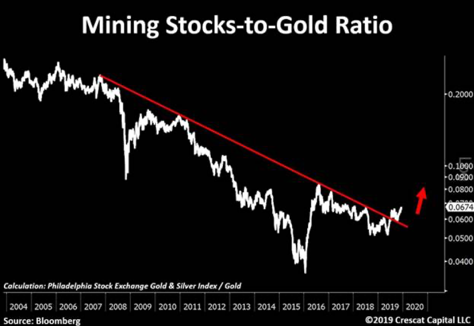
We recently point out this 12-year breakout in mining stocks relative
to gold now looks as solid as a rock. In our view, this is just the
beginning of a major bull market for this entire industry. We encourage
investors to consider our new Crescat Precious Metals SMA strategy which
is performing extremely well this year.
Zero Discounting for Inflation Risk Today
With historic Federal debt relative to GDP and large deficits into
the future as far as the eye can see, if the global financial markets
cannot absorb the increase in Treasury debt, the Fed will be forced to
monetize it even more. The problem is that the Fed’s panic money
printing at this point in the economic cycle may hasten the unwinding of
the imbalances it is so desperate to maintain because it has perversely
fed the last-gasp melt up of speculation in already record over-valued
and extended equity and corporate credit markets. It is reminiscent of
when the Fed injected emergency cash into the repo market at the peak of
the tech bubble at the end of 1999 to fend off a potential Y2K computer
glitch that led to that market and business cycle top. After 40
years of declining inflation expectations in the US, there is a major
disconnect today between portfolio positioning, valuation, and economic
reality. Too much of the investment world is long the “risk parityâ€
trade to one degree or another, long stocks paired with leveraged long
bonds, a strategy that has back-tested great over the last 40 years, but
one that would be a disaster in a secular rising inflation environment.
With historic Federal debt relative to GDP and large deficits into
the future as far as the eye can see, rising long-term inflation, and
the hidden tax thereon, is the default, bi-partisan plan for the US
government’s future funding regardless of who is in the White House and
Congress after the 2020 elections. The market could start discounting
this sooner rather than later. The Fed’s excessive money printing
may only reinforce the unraveling of financial asset imbalances today as
it leads to rising inflation expectations and thereby a sell-off in
today’s highly over-valued long duration assets including Treasury bonds
and US equities, particularly insanely overvalued growth stocks. We
believe we are in the vicinity of a major US stock market and business
cycle peak.
Posted by AGORACOM
at 8:30 AM on Tuesday, January 28th, 2020
Significant upside potential identified at 1,675,000 oz (20.78 Mt @ 2.5 g/t Au) Imbo Concession since 2014 resource estimate
TORONTO, Jan. 28, 2020 — Loncor Resources Inc. (“Loncor” or the “Company“) (TSX: “LN”; OTCQB: “LONCF”) is pleased to provide an update on its activities within the Ngayu Greenstone Belt, where the Company has a dominant foot-print through its joint venture with Barrick Gold (Congo) SARL (“Barrickâ€) and on its own majority-owned prospecting licences and exploitation concessions.
The Ngayu Archean Greenstone Belt of northeastern Democratic Republic of the Congo (the “DRCâ€)
is geologically similar to the belts which host the world class gold
mines of AngloGold Ashanti/Barrick’s Kibali mine in the DRC and
AngloGold Ashanti’s Geita mine in Tanzania. Gold mineralization at Ngayu
is spatially related to Banded Ironstone Formation (“BIFâ€),
which is the case at both Kibali and Geita and is highlighted in
Figures 1 and 2 below. The Ngayu belt is significantly larger in extent
than the Geita belt.
Adumbi Deposit Since the Company’s acquisition of
71.25% of the KGL-Somituri gold project from Kilo Goldmines Ltd. in
September 2019, Loncor has focussed on the Imbo exploitation concession
in the east of the Ngayu belt where an Inferred Mineral Resource of
1.675 million ounces of gold (20.78 million tonnes grading 2.5 g/t Au,
with 71.25% of this Inferred Mineral Resource being attributable to
Loncor via its 71.25% interest) was outlined in January 2014 by
independent consultants Roscoe Postle Associates Inc (“RPAâ€)
on three separate deposits, Adumbi, Kitenge and Manzako (see Figures 3
and 4 below). In this study, RPA made a number of recommendations on
Adumbi, which were subsequently undertaken during the period 2014-18.
The Company’s geological consultants Minecon Resources and Services
Limited (“Mineconâ€) has been assessing the implications of this additional exploration data on Adumbi, which are summarised below.
Additional Drilling RPA recommended additional
drilling at Adumbi to test the down dip/plunge extent of the
mineralization. In 2017, four deeper core holes were drilled below the
previously outlined RPA inferred resource over a strike length of 400
metres and to a maximum depth of 450 metres below surface. All four
holes intersected significant gold mineralization in terms of widths and
grade and are summarised below:
Borehole
From(m)
To(m)
Intercept Width(m)
True Width(m)
Grade (g/t) Au
SADD50
434.73
447.42
12.69
10.67
5.51
SADD51
393.43
402.72
9.29
6.54
4.09
SADD52
389.72
401.87
12.15
7.01
3.24
419.15
428.75
9.60
5.54
5.04
SADD53
346.36
355.63
9.27
5.70
3.71
391.72
415.17
23.45
14.43
6.08
The above drilling results which are shown on the longtitudinal
section (see Figure 5 below), indicate that the gold mineralization is
open along strike and at depth. The drilling of an additional 12 core
holes has the potential to significantly increase the Adumbi mineral
resource as highlighted on the longitudinal section.
Survey and Georeferencing The Adumbi drill hole
collars, trenches, and accessible adits/portals have now been accurately
surveyed and the data appropriately georeferenced. In addition, all
accessible underground excavations and workings have been accurately
surveyed. The new and improved quality of the exploration data will have
positive implications on potential future classification of the mineral
resources.
Re-logging of All Drill Holes The re-logging of
drill holes after the RPA study has defined the presence of five
distinct geological domains in the central part of the Adumbi deposit
where the BIF unit attains a thickness of up to 130 metres (see Figure 4
below). From northeast to southwest:
Upper BIF Sequence: an interbedded sequence of BIF and chlorite schist, 45 to 130 metres in thickness.
Carbonaceous Marker: a distinctive 3 to 17 metre thick unit of black carbonaceous schist with pale argillaceous bands.
Lower BIF Sequence: BIF interbedded with quartz carbonate, carbonaceous and/or chlorite schist in a zone 4 to 30 metres wide.
Footwall Schists: similar to the hanging wall schist sequence.
In the central part of Adumbi, three main zones of gold mineralization are present. These include mineralisation:
Within the Lower BIF Sequence.
In the lower part of the Upper BIF Sequence. Zones 1 and 2 are
separated by the Carbonaceous Marker, which is essentially
unmineralized.
A weaker zone in the upper part of the Upper BIF Sequence.
The lack of a detailed geological model in the previous resource
estimates resulted in wireframes being constructed using only assay
values with little regard to geological domains. This has resulted in
wireframes cross-cutting the geology which could have resulted in
underestimating the previous resource estimate.
Relative Density (“RDâ€) Measurements The increase
in the sample population coupled with the application of a more rigid
RD determination procedure based on recommendations from the RPA
resource study, indicates that the new RD measurements from both
mineralized and unmineralized material and from the various material
types and lithologic units have improved the confidence in the relative
RD determination to be applied to any future resource estimates.
Relative to the 6 oxide RD measurements used for tonnage estimation in
the RPA model, 297 oxide RD measurements within the mineralised domain
were undertaken during the review work. For the transition and fresh
material, equal number of determinations relative to the previous RD
sample volumes were undertaken with the review process employing more
rigid RD determination procedures.
Table 1 below indicates significate positive variance between the
previous model RD and the reviewed work for the oxide and transition
materials.
Table 1: Summary of Previous and Reviewed Mineralised Average RD Measurements
Material Type
RD used in Previous RPA Model
Additional RD Determinations
RD Variance (%)
Oxide
1.80
2.45
36.1
Transition
2.20
2.82
28.2
Fresh
3.00
3.05
1.7
Oxidation and Fresh Rock Surfaces The re-logging
of the core as per the RPA recommendations identified major differences
between the depths of Base of Complete Oxidation (BOCO) and Top of Fresh
Rock (TOFR), and the depths used by RPA in the 2014 model. In the RPA
model, the BOCO was negligible and the TOFR corresponded approximately
to the re-logged BOCO. The deeper levels of oxidation that were observed
during the re-logging exercise should have positive implications for
the Adumbi project with respect to ore type classification and
associated metallurgical recoveries and mining and processing cost
estimates.
Adit Sampling and Georeferencing Following the
accurate surveying of the 10 historical adits and appropriately
georeferencing, the 796 adit samples (1,121 metres in total) when
applied should have positive implications on the data spacing and
classification of any future mineral resources.
In summary, most of the previous recommendations from the 2014 RPA
mineral resource study on Adumbi have been undertaken. In addition, the
previously recommended LIDAR survey by RPA was completed this month over
Adumbi by Southern Mapping of South Africa.
The results of all the above tasks coupled with the higher current
gold price compared with the previous study in 2014 indicate significant
upside at Adumbi. Minecon is undertaking further studies to better
quantify this significant upside. At present and subject to the Company
securing the necessary financing, the Company is planning to drill the
additional 12 deeper holes at Adumbi and then commence a preliminary
economic assessment when an updated mineral resource study will be
undertaken.
Ongoing studies are also continuing by Minecon on further assessing
the data elsewhere on the Imbo exploitation concession including Kitenge
and Manzako.
As announced in November 2019, joint venture partner and operator
Barrick has identified a number of priority drill targets within the
1,894 square kilometre joint venture land package (the “JV Areasâ€)
at Ngayu and that are planned to be drilled during the current dry
season. Drill targets include Bakpau, Lybie-Salisa and Itali in the Imva
area as well as Anguluku in the southwest of the Ngayu belt and
Yambenda in the north. As per the joint venture agreement signed in
January 2016, Barrick manages and funds exploration on the JV Areas at
the Ngayu project until the completion of a pre-feasibility study on any
gold discovery meeting the investment criteria of Barrick. Subject to
the DRC’s free carried interest requirements, Barrick would earn 65% of
any discovery with Loncor holding the balance of 35%. Loncor will be
required, from that point forward, to fund its pro-rata share in respect
of the discovery in order to maintain its 35% interest or be diluted.
About Loncor Resources Inc. Loncor
is a Canadian gold exploration company focused on two projects in the
DRC – the Ngayu and North Kivu projects. Both projects have historic
gold production. Exploration at the Ngayu project is currently being
undertaken by Loncor’s joint venture partner Barrick Gold Corporation
through its DRC subsidiary Barrick Gold (Congo) SARL (“Barrickâ€).
The Ngayu project is 200 kilometres southwest of the Kibali gold mine,
which is operated by Barrick and in 2018 produced approximately 800,000
ounces of gold. As per the joint venture agreement signed in January
2016, Barrick manages and funds exploration at the Ngayu project until
the completion of a pre-feasibility study on any gold discovery meeting
the investment criteria of Barrick. Subject to the DRC’s free carried
interest requirements, Barrick would earn 65% of any discovery with
Loncor holding the balance of 35%. Loncor will be required, from that
point forward, to fund its pro-rata share in respect of the discovery in
order to maintain its 35% interest or be diluted.
Certain parcels of land within the Ngayu project surrounding and
including the Makapela and Yindi prospects have been retained by Loncor
and do not form part of the joint venture with Barrick. Barrick has
certain pre-emptive rights over these two areas. Loncor’s Makapela
prospect has an Indicated Mineral Resource of 614,200 ounces of gold
(2.20 million tonnes grading 8.66 g/t Au) and an Inferred Mineral
Resource of 549,600 ounces of gold (3.22 million tonnes grading 5.30 g/t
Au). Loncor also recently acquired a 71.25% interest in the
KGL-Somituri gold project in the Ngayu gold belt which has an Inferred
Mineral Resource of 1.675 million ounces of gold (20.78 million tonnes
grading 2.5 g/t Au), with 71.25% of this resource being attributable to
Loncor via its 71.25% interest.
Resolute Mining Limited (ASX/LSE: “RSG”) owns 27% of the outstanding
shares of Loncor and holds a pre-emptive right to maintain its pro rata
equity ownership interest in Loncor following the completion by Loncor
of any proposed equity offering. Newmont Goldcorp Corporation (NYSE:
“NEM”; TSX: “NGT”) owns 7.8% of Loncor’s outstanding shares
Additional information with respect to Loncor and its projects can be found on Loncor’s website at www.loncor.com.
Qualified Person Peter N. Cowley, who is President of
Loncor and a “qualified person” as such term is defined in National
Instrument 43-101, has reviewed and approved the technical information
in this press release.
Technical Reports Certain additional information with
respect to the Company’s Ngayu project is contained in the technical
report of Venmyn Rand (Pty) Ltd dated May 29, 2012 and entitled “Updated
National Instrument 43-101 Independent Technical Report on the Ngayu
Gold Project, Orientale Province, Democratic Republic of the Congo”. A
copy of the said report can be obtained from SEDAR at www.sedar.com and
EDGAR at www.sec.gov.
Certain additional information with respect to the Company’s recently
acquired KGL-Somituri project is contained in the technical report of
Roscoe Postle Associates Inc. dated February 28, 2014 and entitled
“Technical Report on the Somituri Project Imbo Licence, Democratic
Republic of the Congo”. A copy of the said report, which was prepared
for, and filed on SEDAR by, Kilo Goldmines Ltd., can be obtained from
SEDAR at www.sedar.com. To the best of the Company’s knowledge,
information and belief, there is no new material scientific or technical
information that would make the disclosure of the KGL-Somituri mineral
resource set out in this press release inaccurate or misleading.
Cautionary Note to U.S. Investors The
United States Securities and Exchange Commission (the “SEC”) permits
U.S. mining companies, in their filings with the SEC, to disclose only
those mineral deposits that a company can economically and legally
extract or produce. Certain terms are used by the Company, such as
“Indicated” and “Inferred” “Resources”, that the SEC guidelines strictly
prohibit U.S. registered companies from including in their filings with
the SEC. U.S. Investors are urged to consider closely the disclosure in
the Company’s Form 20-F annual report, File No. 001- 35124, which may
be secured from the Company, or from the SEC’s website at
http://www.sec.gov/edgar.shtml.
For further information, please visit our website at www.loncor.com,
or contact: Arnold Kondrat, CEO, Toronto, Ontario, Tel: + 1 (416) 366
7300.
Posted by AGORACOM
at 1:56 PM on Monday, January 27th, 2020
Sponsor: Loncor is a Canadian gold exploration company that controls over 2,400,000 high grade ounces outside of a Barrick JV.. The Ngayu JV property is 200km southwest of the Kibali gold mine, operated by Barrick, which produced 800,000 ounces of gold in 2018. Barrick manages and funds exploration at the Ngayu project until the completion of a pre-feasibility study on any gold discovery meeting the investment criteria of Barrick. Click Here for More Info
Barrick Gold’s Kibali mine beat its 2019 production guidance of 750,000 ounces by delivering 814,027 ounces
Kibali is 200km to the southwest of Loncor’s JV with Barrick in search for further Tier Once mining assets
KINSHASA, Democratic Republic of Congo, Jan. 27, 2020 (GLOBE NEWSWIRE) — Barrick Gold Corporation (NYSE:GOLD) (TSX:ABX) - Barrick Gold Corporation’s Kibali mine beat its 2019 production guidance of 750,000 ounces of gold by a substantial margin, delivering 814,027 ounces in another record year.
Barrick president and chief executive Mark Bristow told a media briefing here that Kibali’s continuing stellar performance was a demonstration of how a modern, Tier One gold mine could be developed and operated successfully in what is one of the world’s most remote and infrastructurally under-endowed regions.  He also noted that in line with Barrick’s policy of employing, training and advancing locals, the mine was managed by a majority Congolese team, supported by a corps of majority Congolese supervisors and personnel.
Already one of the world’s most highly automated underground gold
mines, Kibali continues its technological advance with the introduction
of truck and drill training simulators and the integration of systems
for personnel safety tracking and ventilation demand control. The
simulators will also be used to train operators from Barrick’s Tanzanian
mines.
“The completion of the Kalimva Ikamva prefeasibility study has
delivered another viable opencast project which will help balance
Kibali’s opencast/underground ore ratio and enhance the flexibility of
the mine plan. Down-plunge extension drilling at Gorumbwa has
highlighted future underground potential and ongoing conversion drilling
at KCD is delivering reserve replenishment. All in all, Kibali is well
on track not only to meet its 10-year production targets but to extend
them beyond this horizon,†Bristow said.
“We’re maintaining a strong focus on energy efficiency through
the development of our grid stabilizer project, scheduled for
commissioning in the second quarter of 2020. This uses new battery
technology to offset the need for running diesel generators as a
spinning reserve and ensures we maximize the use of renewable hydro
power. The installation of three new elution diesel heaters will also
help improve efficiencies and control power costs. It’s worth noting
that our clean energy strategy not only achieves cost and efficiency
benefits but also once again reduces Kibali’s environmental footprint.â€
Bristow said despite the pace of production and the size and complexity of the mine, Kibali was maintaining its solid safety and environmental records, certified by ISO 45001 and ISO 14001 accreditations. Â It also remained committed to community upliftment and local economic development. Â In 2019, it spent $158 million with Congolese contractors and suppliers and in December, it started work on a trial section for a new concrete road between Durba and the Watsa bridge.
Posted by AGORACOM
at 2:04 PM on Wednesday, January 22nd, 2020
SPONSOR: American Creek owns a 20% Carried Interest to Production at the Treaty Creek Project in the Golden Triangle. 2019’s first hole averaged of 0.683 g/t Au over 780m in a vertical intercept. The Treaty Creek property is located in the same hydrothermal system as the Pretivm and Seabridge’s KSM deposits. Click Here for More Info
For the second time in as many weeks, the world’s largest hedge fund is once again talking up gold as an important diversifier for investors.
Speaking to CNBC’s Squawk Box on the sideline of the World Economic
Forum in Davos, Switzerland, Ray Dalio, founder of Bridgewater
Associates, said that in the current environment, investors should hold a
global diversified portfolio that includes some gold.
“Cash is trash,†he declared in the interview. He warned that investors should get out of cash as central banks continue to print money.
However, Dalio tempered his comments on the precious metal, saying that “a bit of gold is a diversifier.â€
But it is not only cash that Dalio railed against. He also didn’t
have anything nice to say about bitcoin, which is neither a medium of
exchange nor a store of value.
He said that investors shouldn’t go anywhere near bitcoin because of
its volatility. When it comes to a store of value, central banks will
continue to prefer to hold hard assets.
“What are [central banks] going to hold as reserves? What has been
tried and true? They are going to hold gold. That is a reserve
currency, and it has been a reserve currency for a thousand years,†he
said.
Although Dalio said that he sees a low chance of a recession in
2020, he warned investors to look further out. The risks are that
because of where monetary policy is right now, it will be less
effective when the downturn does come.
“At a point in the future, we still are going to think about what’s a
storeholder of wealth. Because when you get negative-yielding bonds or
something, we are approaching a limit that will be a paradigm shift,â€
he said.
Dalio has been fairly bullish on gold and for nearly three years has
advocated that investors hold at least 5% to 10% of their portfolio in
gold.
Dalio’s latest comments come less than a week after Greg Jensen,
co-chief investment officer at Bridgewater Associates, said in an
interview with the Financial Times that he sees gold pushing to $2,000
an ounce.
Jensen said that he sees higher gold prices through 2020 as
inflation picks up but central banks, in particular the Federal Reserve,
step away from the fight.
“The Fed won’t be pre-emptive,†he said.
Jensen said that he is also bullish on gold as geopolitical uncertainty dominates financial markets and investor sentiment.
“When you look at the geopolitical strife, how many foreign entities
really want to hold dollars? And what are they going to hold? Gold
stands out,†he said.
Posted by AGORACOM
at 11:58 AM on Wednesday, January 22nd, 2020
SPONSOR: Labrador Gold – Two successful gold explorers lead the way in the Labrador gold rush targeting the under-explored gold potential of the province. Exploration has already outlined district scale gold on two projects, including a 40km strike length of the Florence Lake greenstone belt, one of two greenstone belts covered by the Hopedale Project. Click Here for More Info
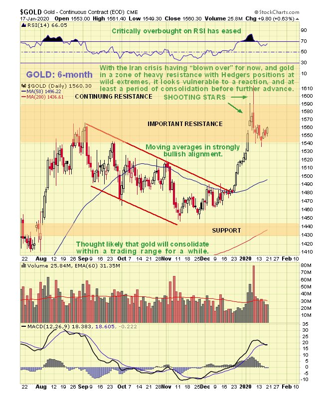
At first glance gold looks like it may be about to advance out of a
bull Flag, but there are a number of factors in play that we will
examine which suggest that any near-term advance won’t get far before it
turns and drops again, and that a longer period of consolidation and
perhaps reaction is necessary before it makes significant further
progress.
On the 6-month chart we can see how gold stabbed into a zone of
strong resistance on the Iran crisis around the time Iran’s General was
murdered, but after a couple of bearish looking candles with high upper
shadows formed, it backed off into what many are taking to be a bull
Flag.
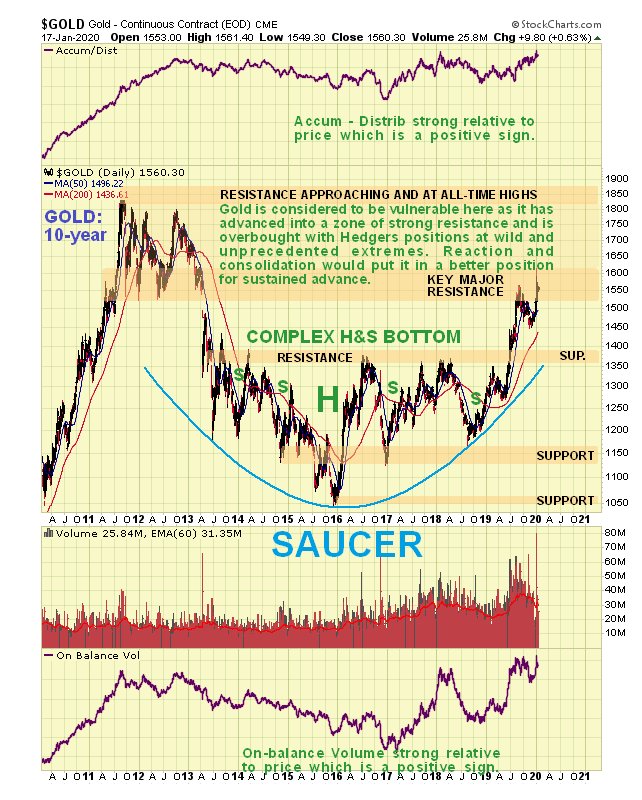
The 10-year chart makes it plain why gold is vulnerable here to
reacting back over the short to medium-term, because it has advanced
deep into “enemy territory†– the broad band of heavy resistance
approaching the 2011 highs, with a zone of particularly strong
resistance right where it is now. It would be healthier and increase
gold’s chances of breaking out to new highs if it now backed off into a
trading range for a while to moderate what now looks like excessive
bullishness.
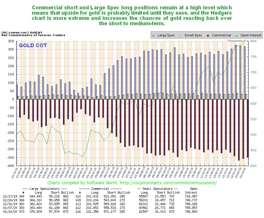
Thus it remains a cause for concern (or it should be for gold
bulls) to see gold’s latest COTs continuing to show high Commercial
short and Large Spec long positions. Is it “going to be different this
time� – the latest Hedgers charts that we are now going to look at
suggest not.
Click on chart to popup a larger, clearer version.
The COT chart only goes back a year. The Hedgers charts shown
below, which are a form of COT chart, go back many years, and frankly,
they look pretty scary.
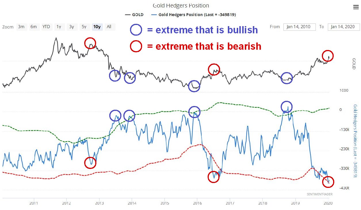
We’ll start by looking at the Hedger’s chart that goes back to before
the 2011 sector peak. On it we see that current Hedgers positions are
at extremes that way exceed even those at the peak of the 2012 sucker
rally, which was followed by the bulk of the decline in the bearmarket
that followed. Does this mean that we are going to see another
bearmarket like that – no it doesn’t, but it does mean that these
positions will probably need to moderate before we see significant
further gains.
Click on chart to popup a larger, clearer version.
Chart courtesy of sentimentrader.com
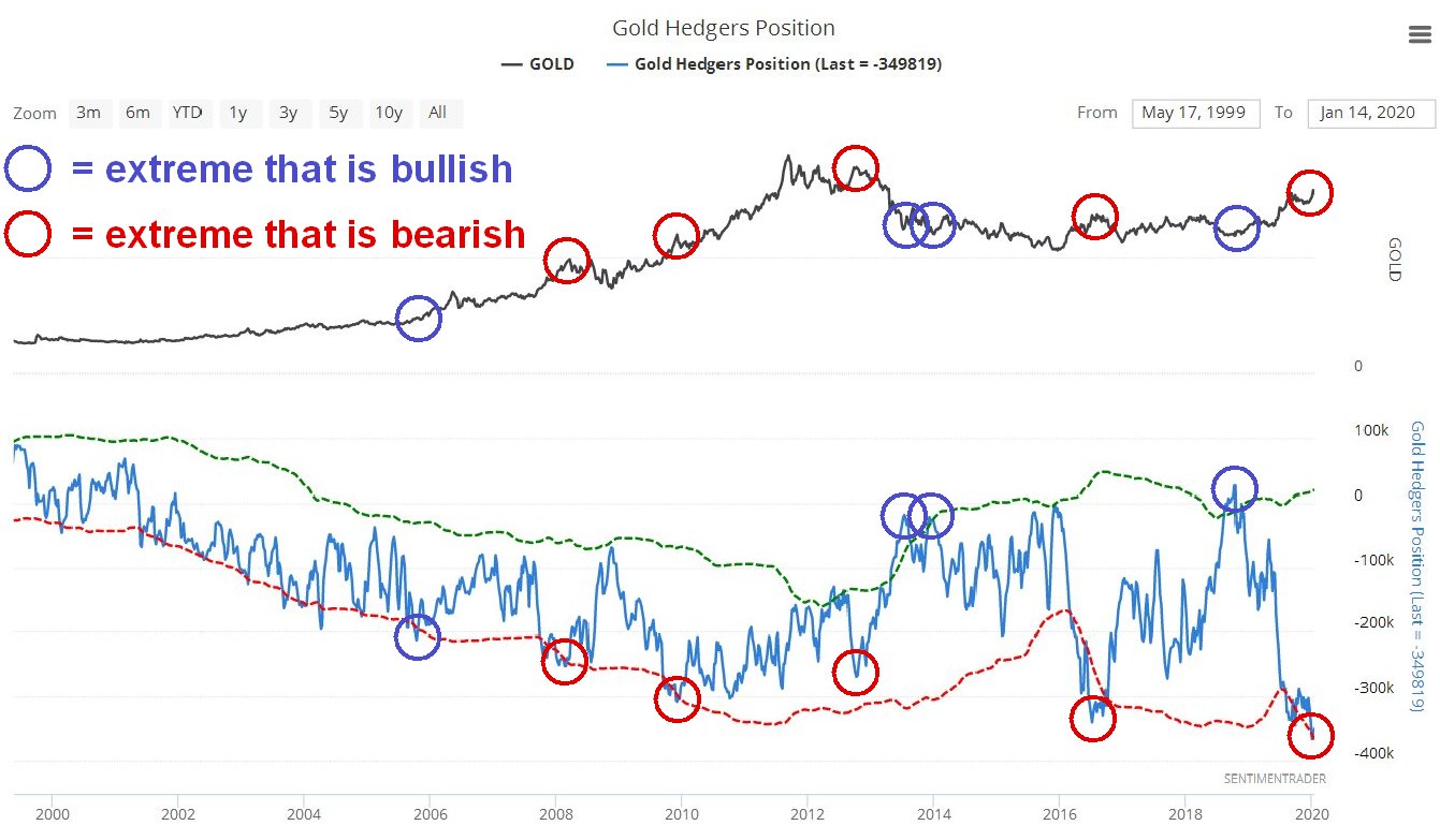
Looking at the Hedgers chart going way back to before the year
2000, we see that the current readings are record readings by a
significant margin and obviously increase the risks of a sizeable
reaction. We can speculate about what the reasons for a decline might
be, one possibility being the sector getting dragged down by a
stockmarket crash after its blowoff top, which may be imminent, as
happened in 2008, since it remains to be seen whether investors will
rush into the sector as a safe haven in the event of a market crash.
Click on chart to popup a larger, clearer version.
Chart courtesy of sentimentrader.com
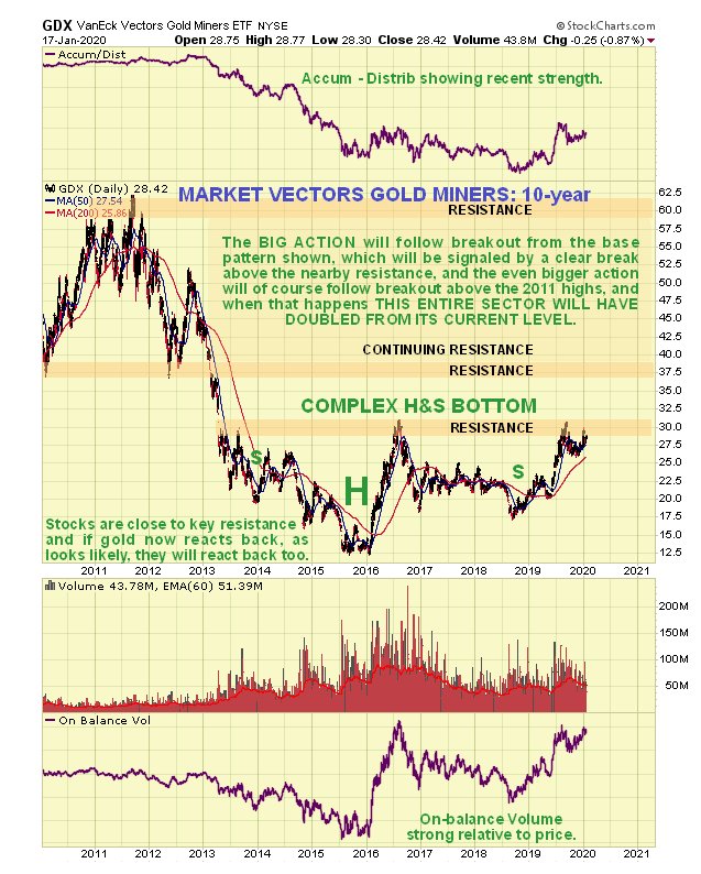
Turning now to Precious Metals stocks, we see on its latest
10-year chart that GDX still looks like it is completing a giant
Head-and-Shoulders bottom pattern. However, it is currently dithering
just beneath resistance at the top of this base pattern, which means
that it is vulnerable to backing off.
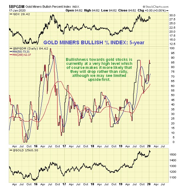
So, how then does gold stock sentiment look right now? As we can
see on the 5-year chart for the Gold Miners’ Bullish Percent Index,
bullishness towards the sector is now at a very high level, 84.6%, which
makes it more likely that stocks will drop soon rather than rally, and
what they could do of course is rally some to increase this level of
bullishness still further, and then drop.
Does all this mean that investors in the sector should suddenly
rush for the exits? No, it doesn’t, especially as the charts for many
individual stocks across the sector look very bullish, and it may be
that all that is needed is a cooling period of consolidation. However it
does make sense to use Hedges at extremes, such as leveraged inverse
ETFs and better still options as insurance, which have the advantage of
providing protection for a very small capital outlay, a fine example
being GLD Puts which are liquid with narrow spreads. We did this just ahead of the recent peak
when Iran lobbed a volley of missiles at Iraq. We will not be selling
our strongest gold and silver stocks, but instead look to buy more on
dips.
Posted by AGORACOM
at 2:54 PM on Tuesday, January 21st, 2020
Sponsor: Affinity Metals (TSX-V: AFF) a Canadian mineral exploration company building a strong portfolio of mineral projects in North America. The Corporation’s flagship property is the Drill ready Regal Property near Revelstoke, BC. Recent sampling encountered bonanza grade silver, zinc, and lead with many samples reaching assay over-limits. Click Here for More Info
(Kitco News) – The
merger and acquisition activity that swept through the mining sector in
2019 is only going to pick up momentum this year as mine developers and
junior explorers are next on the auction block, according to one
financing company.
In a recent webinar, Derek Macpherson, vice president of research at
Red Cloud, said that with gold in the early inning of a new bull market,
he expects to see more M&A activity in the mining sector.
However, he added that sentiment is a little different than it was in 2019.
“The M&A activity we saw last year focused on production assets,â€
he said. “As we see fewer of those assets become available companies
will have to look further down cap. I think we are getting a lot closer
to seeing junior explorers benefit from M&A activity.â€
The comments come as junior explorers continue to struggle to attract
investor attention. The sector was still largely ignored in 2019 as the
M&A activity focused on creating mega-gold companies and larger
producers.
Macpherson said that although some companies are struggling to
attract attention, investors should focus on the companies that are
activity developing and de-risking their projects.
“In this environment and with the potential for more M&A activity, the drill bit is the key to value,†he said.
Macpherson added because of solid production and higher prices in
2019 many mid-tier mining companies are in good shape to go shopping in
the market again. Further divestitures from the major gold producers
also means more opportunities to buy.
Not only are miners in a hurry to replace dwindling reserves, but
Macpherson noted that a strong gold price will add to growing confidence
in the marketplace. He noted that there are growing calls for $2,000
gold.
“I think gold at $1,600 is in the mix but I also don’t think $2,000 is out of the realm of possibilities,†he said.
Looking at the gold market, the financial firm sees strong investment
demand for the yellow metal as central banks around the world maintain
ultra-loose monetary policy.
“More money printing and negative yielding debt make gold a very attractive asset class,†he said.
Macpherson also noted that with equity markets at record valuations,
it wouldn’t take much for investors jump out off the S&P and into
more safe-haven assets.
Posted by AGORACOM
at 11:37 AM on Tuesday, January 21st, 2020
Sponsor: Loncor is a Canadian gold exploration company that controls over 2,400,000 high grade ounces outside of a Barrick JV. Exploration is currently being conducted by Barrick. The Ngayu property is 200km southwest of the Kibali gold mine, operated by Barrick, which produced 800,000 ounces of gold in 2018. Barrick manages and funds exploration at the Ngayu project until the completion of a pre-feasibility study on any gold discovery meeting the investment criteria of Barrick. Click Here for More Info
Gold is a hedge against inflation that is being used more and more
Goldex CEO pointed to a recent Goldman Sachs report that pointed to gold as being a better hedge than oil.
This view is the new consensus that will increase demand for gold.
(Kitco News) What can take the
gold market from $1,550 to $1,600 and higher? Goldex CEO and founder
Sylvia Carrasco told Kitco News that she is not ruling out the $1,900 an
ounce level this year if geopolitical and trade tensions escalate in
the current economic climate.
There are a number of strong drivers supporting gold prices this
year, including geopolitical and trade tensions, global debt, dovish
central banks, weakening U.S. dollar as well as the political situation
in the U.S., Carrasco said on Thursday.
“Last year, I said that the perfect storm was forming and I think I
would use this phrase again. The perfect storm is now happening,”
Carrasco noted. “Gold should be around $1,600 if nothing else crazy
happens. At this moment in time, I can see gold between the $1,500 and
the $2,000 mark during 2020.”
If the market sees a further increase in geopolitical tensions or
additional trade concerns this year, gold will surge towards $1,900,
Goldex CEO pointed out. And if things do calm down, Carrasco does not
see gold falling much below $1,500 an ounce.
“It is going to be another record year,” she said, referring to gold
hitting record-highs in many currencies last year. “And it will be
mainly due to geopolitical tensions raising prices higher.”
“With the current economic climate, gold should be between $1,500 and
$1,600. If on top of that bare minimum, you add very strong
geopolitical tensions or commercial trade issues, then you take it from
$1,600 up to $1,900,” she added.
At the time of writing, the spot gold price was trading at $1,560.40,
up 0.24% on the day and up 2.8% since the start of the year.
Gold is a hedge against inflation that is being used more and more by
investors who are realizing the benefits of the yellow metal, Carrasco
said.
“Gold is the hedge that people should be using. I wouldn’t build my
personal wealth portfolio just on gold. But gold is more and more
clearly overtaking oil and any other hedging mechanisms … Gold will be a
good trade whether for speculative reasons or for trading,” she noted.
Goldex CEO pointed to a recent Goldman Sachs report
that pointed to gold as being a better hedge than oil. Carrasco added
that this view is the new consensus that will increase demand for gold.
Gold began the year with a bang as U.S.-Iran tensions flared up and surprised the markets in the first two weeks of January.
“The rally we’ve seen is based on geopolitical tensions between the
U.S. and Iran. We need to see also the reasons behind Trump’s approach
when it comes to Iran … In September, the U.S. ended up a positive net
exporter of oil for the first time in history. That gives you a reason
why Trump thinks he is not affected by the tensions even though the rest
of the world is affected,” Carrasco described.
Also, U.S. President Donald Trump was driven by the goal to distract
the market from the impeachment proceedings against him, she added.
Going forward, gold prices are likely to rise further, especially
considering that most of the major central banks around the world are
not planning to start raising rates any time soon.
“Central banks using unconventional ways … Is there going to be an
increase in interest rates in Europe or in the U.S.? The answer is no.
And if interest rates are not going to increase, gold is the first one
that is affected,” Carrasco said.
On top of that, the central banks will remain significant gold buyers
in 2020. “That’s another reason why gold prices will increase this
year,” she said.
Growing debt also supports higher gold prices this year, the CEO
added. “We’ve been talking about debt for years — how corporate debt and
government debt continues to increase. More debt effectively means a
potentially weaker U.S. dollar. The moment the U.S. dollar is weak,
where do you go? The only safe place is gold. And I think we are going
to be seeing a weakening dollar as the year continues,” Carrasco
described.
Posted by AGORACOM
at 8:23 AM on Monday, January 20th, 2020
Cardston, Alberta–(Newsfile Corp. – January 20, 2020) – American Creek Resources Ltd.
(TSXV: AMK) (the “Company” or “American Creek”) is pleased to announce
that it has entered into a property purchase agreement pursuant to which
it will acquire the precious and base mineral undersurface rights
relating to 45 Crown Grant claims commonly referred to as the “Glacier
Creek Claims” located in the Stewart area, British Columbia, from a
subsidiary of Strikepoint Gold Inc. (TSXV:SKP)(“Strikepoint“). In
consideration for the Glacier Creek Claims, the Company will pay
Strikepoint $50,000, issue 3,000,000 common shares to Strikepoint, and
grant Strikepoint a 0.5% NSR royalty over the Glacier Creek Claims which
NSR royalty may be purchased by the Company at any time for $500,000
cash.
The Glacier Creek Crown Grant claim package consists of claims that overlap a portion of the Company’s
present Dunwell property as well as extending beyond the current
Dunwell property boundaries. The net effect being a significant
expansion of the Dunwell project and associated mineral rights.
Darren
Blaney, President & CEO of the Company stated: “We are very pleased
to be able to acquire this package of Crown Grants as it makes sense to
amalgamate the claims into one property. This acquisition expands our
Dunwell property considerably and provides for increased exploration
potential as work is done in the immediate area hosting the historic
Dunwell Mine as well as in the surrounding region. We believe that the
Dunwell Mine and the multiple bonanza grade gold and silver showings
within several kilometers of the mine are all related geologically and
are part of a large underlying system”.
Completion of this
acquisition is conditional upon, among other things, receipt of all
necessary regulatory approvals, including approval of the TSX Venture
Exchange.
Any shares issued pursuant to this transaction will be subject to a 4 month hold period pursuant to applicable securities laws.
About American Creek
American
Creek is a Canadian junior mineral exploration company with a strong
portfolio of gold and silver properties in British Columbia.
Three
of those properties are located in the prolific “Golden Triangle”; the
Treaty Creek and Electrum joint venture projects with Tudor Gold/Walter
Storm as well as the 100% owned past producing Dunwell Mine.
A
major drill program was conducted in 2019 at Treaty Creek by JV partner
and operator Tudor Gold. The focus of the program was on the Goldstorm
zone where drilling has produced very wide intercepts of gold including a
780 meter intercept of 0.683 g/t gold including a higher grade upper portion of 1.095 g/t over 370.5 meters.
The
Treaty Creek Project is a Joint Venture with Tudor Gold owning 60% and
acting as operator. American Creek and Teuton Resources each have 20%
interests in the project. American Creek and Teuton are both fully
carried until such time as a Production Notice is issued, at which time
they are required to contribute their respective 20% share of
development costs. Until such time, Tudor is required to fund all
exploration and development costs while both American Creek and Teuton
have “free rides”.
A drill program was also recently concluded on
the 100% owned Dunwell Mine property located near Stewart. Assay
results are pending.
The Corporation also holds the Gold Hill,
Austruck-Bonanza, Ample Goldmax, Silver Side, and Glitter King
properties located in other prospective areas of the province.
For further information please contact Kelvin Burton at: Phone: 403 752-4040 or Email: [email protected]. Information relating to the Company is available on its website at www.americancreek.com
Posted by AGORACOM
at 2:44 PM on Saturday, January 18th, 2020
SPONSOR: American Creek owns a 20% Carried Interest to Production at the Treaty Creek Project in the Golden Triangle. 2019’s first hole averaged of 0.683 g/t Au over 780m in a vertical intercept. The Treaty Creek property is located in the same hydrothermal system as the Pretivm and Seabridge’s KSM deposits. Click Here for More Info
From the HRA Journal: Issue 314
The fun doesn’t stop. Waves of liquidity continue to wash traders
cares away. Even assassinations and war mongering generate little more
than half day dips on Wall St. It seems nothing can get in the way of
the bull rally that’s carrying all risk assets higher.
It feels like it could go on for a while, though I think the
liquidity will have to keep coming to sustain it. By most readings,
bullishness on Wall St is at levels that are rarely sustained for more
than a few weeks. Some sort of correction on Wall St seems highly
likely, and soon. Whether its substantial or just another blip on the
way higher remains to be seen.
The resource sector, especially gold and silver stocks, have had
their own rally. Our Santa Claus market was as good or better than Wall
St’s for a change. And I don’t think its over yet. I think we’re in for
the best Q1 we’ve seen for a few years. And we could be in for something
better than that even. I increasingly see signs of a major rally
developing in the gold space. It’s already been pretty good but I think a
multi-quarter, or longer, move may be starting to take shape.
I usually spend time on all the metals in the first issue of the
year. But, because the makings of this gold rally are complex and long
in coming I decided to detail my reasoning. That ended up taking several
pages so I’ll save talk on base metals and other markets for the next
issue.
No, I’m not writing about Louis IV, though there might be some
appropriateness to the analogy, now that I think about it. The quote is
famous, even though there’s no agreement on what it was supposed to
mean. Most figure Louis was referring to the biblical flood, that all
would be chaos once his reign ended.
The deluge I’m referring to isn’t water. It’s the flood of money the
US Fed, and other central banks, continue to unleash to keep markets
stable. Markets, especially stock markets, love liquidity. You can see
the impact of the latest deluge, particularly the US Fed’s in the chart
below that traces both the SPX index value and the level of a “Global
Liquidity Proxy†(“GLPâ€) measuring fiscal/monetary tightness and
weakness.
You can see the GLP moved lower in late 2018 as the Fed tightened and
the impact that had on Wall St. Conversely, you can see the SPX running
higher in the past couple of months as the US backed off rate
increases, increased fiscal deficit expansion, and grew the Fed balance
sheet through, mainly, repo market operations.
Wall St, and most other bourses, are loving these money flows. The
Santa Claus rally discussed in the last issue continued to strengthen
all the way to and through year end. As it turned out, the Fed either
provided enough backstop in advance or the yearend repo issues were
overstated. The repo market itself was calm going through year end and a
lot of the short-term money offered by the Fed during that week wasn’t
taken down.
Everything may have changed in the past couple of days with the
dramatic increase in US-Iran tensions. I don’t know how big an issue
that will be, since no one knows what form Iran’s retaliation will be or
how much things will escalate. I DO think it’s potentially a big deal
with very negative connotations, but it may take time to unfold. Someone
at the Fed thought so too, as the past couple of days saw a return to
large scale Fed lending in the repo market.
I’ve no doubt Iran will try and take revenge for the assassination of
its most famous military commander by the US. But I don’t know what
form it will take and if this means the US has drawn itself into the
Mideast quagmire even more. I fear it has though. The US is already
talking about adding 3,000 troops to its Mideast presence and they’re
just warming up. Even larger scale attacks, if they happen, may not
derail Wall St, but they’re certainly not a positive development at any
level.
We know how stretched both market valuations and sentiment were
before the Suleimani drone strike. The chart below shows a three-year
trace of the “fear/greed indexâ€. You can see that its hardly a stable
reading. It flip flops often and extreme readings rarely hold for long.
At last check, the reading was 94% bullish.
Sentiment almost never gets that bullish and, when it does, nothing
good comes of it for bulls. A reading that close to 100% tells you we’re
just about out of buyers. Whatever happens in and around Iran, I think a
near term correction is inevitable. The only question is whether it’s a
large one or not.
A rapid escalation in US-Iran tensions could certainly make a near
term correction larger. If the flood of liquidity continues though, a
correction could just be another waystation on the road to higher highs.
There are a couple of other dangers Wall St still faces that I’ll touch
on briefly at the end of this article. First however, lets move on to
the main event for us-the gold market.
It wasn’t just the SPX enjoying a Santa rally this year. Gold
experienced the rally we were hoping for that gold miner stocks seemed
to be foretelling early last month. Gold’s been doing well since it
bottomed at $1275 in June, but it didn’t feel that way during the long
hiatus between the early September high and the current move. The gold
price currently sits above September’s multi-year high, after breaching
that high in the wake of the Baghdad drone strike. And the first
retaliatory strike by Iran. Volatility will be very high for a while
going forward.
I think we’ll see more multi-year highs going forward. I hate that
the latest move higher is driven by geopolitics. Scary geopolitics and
military confrontations mean people are dying. We don’t want to profit
from misery. And we won’t anyway, if things get ugly enough in the
Mideast to scare traders out of the market.
Geopolitical price moves almost always unwind quickly. I’d much
prefer to see gold moving higher for macro reasons, not as a political
safety trade. I expect more political/military inspired moves. As the
Iran conflict unfolds. Make no mistake, Iran is NOT Iraq. Its army is
far larger, better trained and better equipped than Iraq. This could get
ugly.
The balance of this piece will deal with my macro argument for higher
gold prices over an extended period. The geopolitical stuff will be
layered on top of that for the next while and could strengthen both gold
prices and the $US in risk-off trading. It should be viewed as a
separate event from the argument laid out below.
What else is driving gold higher? In part, it was gold’s inverse
relationship with the US Dollar. As you already know, I’m not a believer
that “its all about the USD, all the time†when it comes to the gold
market. That’s an over-simplification of a more complex relationship. It
also discounts the idea of gold as its own asset class that trades for
its own reasons.
If you look at the gold chart above, and the USD chart below it, its
immediately apparent that there isn’t a constant negative correlation at
play. Gold rallied during the summer at the same time the USD did and
for the same reason; the world-wide explosion of negative real yields.
Gold weakened a bit when yields reversed to the upside and the USD got a
bit of traction, but things changed again at the start of December.
The USD turned lower and lost two percent during December. US bond
yields were generally rising during the month and the market (right or
wrong) was assuming economic growth was accelerating. So, neither of
those items explains the USD weakness.
If gold was a “risk off†trade, you sure couldn’t see it in the way
any other market was trading. So, is there another explanation for
recent strength in the gold price, and what does it tell us about 2020
and, perhaps, beyond?
Well, I’ve got a theory. If I’m right, it could mean a bull run for gold has a long way to go.
Some of this theory will be no surprise to you because it does
partially hinge on further USD weakness. There are long term structural
reasons why the US currency should weaken. But there are also
fluctuating sources of demand for USDs, particularly from offshore
buyers and borrowers that transact in US currency. That can create
enough demand to strengthen the US over long periods. We just went
though one such period, but it looks like that may have come to an end,
with more bearish forces to the USD reasserting themselves.
How did we get here? Let’s start with the big picture, displayed on
the top chart on the next page. It gives a long-term view of US Federal
deficits and the unemployment rate. Normally, these travel in tandem.
Higher unemployment means more social spending and higher deficits.
Government spending expands during recessions and contracts-or should-
(as a percentage of GDP) during expansions. Classic Keynesian stuff.
You rarely see these two measures diverge. The two times they did
significantly before, on the left side of the chart, was due to “wartime
deficits†which acted (along with conscription) to stimulate the
economy and drive down unemployment.
You can see the Korean and Vietnam war periods pointed out on the chart.
The current period stands out for the extreme size of the divergence.
US unemployment rates are at multi decade lows and yet the fiscal
deficit as a percentage of GDP keeps rising. There has never been a
divergence this large and its due to get larger.
We know why this is. Big tax cuts combined with a budget that is
mostly non-discretionary. And the US is 10 years into an economic
expansion, however weak. Just think what this graph will look like the
next time the US goes into recession.
We can assume US government deficits aren’t going to shrink any time
soon (and I think we can, pun intended, take that to the bank). That
leaves trade in goods to act as a counterbalance to the funding demand
created by fiscal deficits.
The chart above makes it clear the US won’t get much help from
international trade. The US trade balance has been getting increasingly
negative for decades. It’s better recently, but unlikely to turn
positive soon, and maybe not ever.
To be clear, this is not a bad thing in itself, notwithstanding the
view from the White House. The relative strength of the US economy and
the US Dollar and cheaper offshore production costs have driven the
trade balance. It’s grown because Americans found they got more value
buying abroad and the world was happy to help finance it. It’s not a bad
thing, but not a US Dollar support either.
The more complete picture of currency/investment flows is given by
changes in the Current Account. In simplified terms, the Current Account
measures the difference between what a country produces and what it
consumes. For example, if a country’s trade deficit increases, so does
its current account deficit. If there are funds flowing in from overseas
investments on the other hand, this decrease the Current Account
deficit or increase the surplus.
The graph below summarizes quarterly changes in the US current
account. You can see how the balance got increasingly negative in the
mid 2000’s as both imports and foreign investment by US companies
increased.
Not coincidentally, this same period leading up to the Financial
Crisis included a sustained downtrend in the US Dollar Index. The USD
index chart on the bottom of the next page shows the scale of that
decline, from an index value of 120 at the start of 2002 all the way
down to 73 in early 2008.
The current account deficit (and value of the USD) improved markedly
up to the end of the Financial Crisis as money poured into the US as a
safe haven and consumers cut back on imports. The current account
deficit bas been relatively stable since then, running at about
$100bn/quarter until it dipped a bit again last year.
Trade, funds flows and changes in money supply have the largest
long-term impacts on currency values. When the US Fed ended QE and
started tightening monetary conditions in 2014, the USD enjoyed a strong
rally. The USD Index was back to 100 by early 2015 and stayed there
until loosening monetary conditions-and lots of jawboning from
Washington-led to pullback. Things reversed again and the USD maintained
a mild uptrend from early 2018 until now.
There are still plenty of US Dollar bulls around, and their arguments
have short-term merit. Yes, the US has higher real interest rates and
somewhat higher growth. Both are important to relative currency
valuations as I’ve said in the past. Longer term however, the “twin
deficits†-fiscal and current account-should underpin the fundamental
value of the currency.
Movements don’t happen overnight, especially when you’re talking
about the worlds reserve currency that has the deepest and largest
market supporting it. Changing the overall trend for the USD is like
turning a supertanker. I think it’s happening though, and it has big
potential implications for commodities, especially gold.
Dollar bulls will tell you the USD is the “cleanest shirt in the
laundry hamperâ€, referring to the relative strength of the growth rate
and interest rates compared to other major currencies. That’s true if we
just look at those measures but definitely not true when we look at the
longer term-fiscal and current account deficits.
In fact, the US has about the worst combined fiscal/current account deficit in the G7. The chart at the bottom of this page, from lynalden.com
shows the 2018 values for Current Account and Trade balances for a
number of major economies, as a percentage of their GDP. It’s not a
handsome group.
Both the trade and current account deficits are negative for most of
them. In terms of G7 economies, the US has the worst combined
Current/Trade deficit at 6% of GDP annually. You may be surprised to
note that the Current/Trade balance for the Euro zone is much better
than the US, thanks to a large Trade surplus. Much of that is generated
by Germany. Indeed, this chart explains Germanys defense of the Euro.
It’s combined Trade/Current Account surplus is so large it’s currency
would be skyrocketing if it still used the Deutschmark.
Because the current account deficit is cumulative, the overall
international investment position of the US has continued to worsen. The
US has gone from being an international creditor to an international
debtor, and the scale if its debt keeps increasing. That means it’s
getting harder every year to reverse the current account position as the
US borrows ever more abroad to cover its trade and fiscal deficits.
Interest outflows keep growing and investment inflows shrinking.
Something has to give.
The US has to borrow overseas, as private domestic demand for
Treasury bonds isn’t high enough to fund the twin deficits. In the past,
whenever the US Dollar got too high, offshore demand for US government
debt diminished. It’s not clear why. Maybe the higher dollar made
raising enough foreign funds difficult, or perhaps buyers started
worrying about the USD dropping after they bought when it got too
expensive. Whatever the reason, foreign holdings of US Treasuries have
been declining, forcing the US to find new, domestic, buyers.
Last year, the US Fed stopped its quantitative tightening program,
due to concerns about Dollar liquidity. Then came the repo market. Since
September, the Fed’s balance sheet has expanded by over $400 billion,
mainly due to repo market transactions.
The Fed maintains this “isn’t QE†because these are very short duration transactions but, cumulatively, the total Fed balance sheet keeps expanding. The “QE/no QE†debate is just semantics.
What do these transactions look like? Mostly, its Primary Dealers,
banks that also take part in Treasury auctions, in the repo market. The
Fed buys bonds, usually Treasuries, from these banks and pays for them
in newly printed Dollars. That injects money into the system, helps hold
down interest rates in the repo market and, not coincidentally,
effectively helps fund the US fiscal deficit. To put the series of
transactions in their simplest form, the US is effectively monetizing its deficit with a lot of these transactions.
The chart below illustrates the problem for the Primary Dealer US
banks. They’ve got to buy Treasuries when they’re auctioned-that is
their commitment as Primary Dealers. They also need to hold minimum cash
balances as a percentage of assets under Basel II bank regulations.
Cash balances fell to the minimum mandated level by late 2019- the
horizontal black line on the chart. That’s when the trouble started.
These banks are so stuffed with Treasuries that they didn’t have
excess cash reserves to lend into the repo market. Hence the blow up
back in September and the need for the Fed to inject cash by buying
Treasuries. The point, however, is that this isn’t really a “repo market
issueâ€, that’s just where it reared its head. It’s a “too many
Treasuries and not enough buyers†problem.
It will be tough for the Treasury to attract more offshore buyers
unless the USD weakens, or interest rates rise enough to make them
irresistible. Or a big drop in the federal deficit reduces the supply of
Treasuries itself.
I doubt we’ll see interest rates move up significantly. I don’t think
the economy could handle it and it would be self-defeating anyway, as
the government deficit would explode because of interest expenses. And
that’s not even taking into account the fact that President Trump would
be freaking out daily.
Based on recent history and political expediency, I’d say the odds of
significant budget deficit reductions are slim and none. That’s
especially true going into an election year. There’s just no way we’re
going to see spending restraint or tax increases in the next couple of
years. Indeed, the supply of Treasuries will keep growing even if the US
economy grows too. If there is any sort of significant slowdown or
recession the Federal deficit will explode and so will the new supply of
Treasures. Not an easy fix.
Barring new haven demand for US Treasuries, odds are the Fed will
have to keep sopping up excess supply. That means expanding its balance
sheet and, in so doing, effectively increasing the US money supply.
That brings us (finally!) to the “money shot†chart that appears
above. It compares changes in the size of the Fed balance sheet and the
US Dollar Index. To make it readable and allow me to match the scales, I
generated a chart that tracks annual percentage changes.
The chart shows a strong inverse correlation between changes in the
size of the Fed balance sheet and the value of the USD. This is
unsurprising as most transactions that expand the Fed balance sheet also
expand the money supply.
It’s impossible to tell how long the repo market transactions will
continue but, after three months, they aren’t feeling very “temporaryâ€.
To me, it increasingly looks like these market operations are “debt
monetization in dragâ€.
I don’t know if that’s the Fed’s real intent or just a side effect.
It doesn’t really matter if the funding and money printing continues at
scale. Even if the repo market calms completely, the odds are good we
see some sort of “new QE†start up. Whatever official reason is given
for it; I think it will happen mainly to soak up the excess supply of
Treasuries fiscal deficits are creating.
I don’t blame the FOMC if they’re being disingenuous about it. That’s
their job after all. If you’re a central banker, the LAST thing you’re
going to say is “our government is having trouble finding buyers for its
debtâ€, especially if its true.
With no prospect of lower deficits and apparent continued reduction
in offshore Treasury holdings, this could develop into long-term
sustained trend. I don’t expect it to move in a straight line, markets
never do. A severe escalation in Mideast tensions or the start of a
serious recession could both generate safe-haven Treasury buying. Money
flows from that would take the pressure off the Fed and would be US
Dollar supportive too.
That said, it seems the US has reached the point where a substantial
increase in its central bank’s balance sheet is inevitable. Both Japan
and the Eurozone have gotten there before the Fed, but it looks like it
won’t be immune.
The Eurozone at least has a “Twin surplus†to help cushion things.
And Japan, considered a basket case economically, had an extremely deep
pool of domestic savings (far deeper than the US) to draw on. Until very
recently, Japan also ran massive Current Account surpluses thanks to
decades of heavy investments overseas by Japanese entities. Those
advantages allowed the ECB and especially the BoJ to massively expand
their balance sheets without generating a huge run up in interest rates
or currency collapse.
I don’t know how far the US Fed can expand its balance sheet before
bond yields start getting away from it. I think pretty far though.
Having the world’s reserve currency is a massive advantage. There is
huge built in demand for US Dollars and US denominated debt. That gives
the Fed some runway if it must keep buying US Treasuries.
Assuming a run on yields doesn’t spoil the party, continued balance
sheet and money supply expansion should put increasing downward pressure
on the US Dollar. I don’t know if we’ll see a move as large as the
mid-2000s but a move down to the low 80s for the USD Index over the
course of two or three years wouldn’t be surprising.
It won’t be a straight-line move. A recession could derail things,
though the bear market on Wall St that would generate would support
bullion. Currency markets tend to be self-correcting over extended
periods. If the USD Index falls enough and there is a bump in US real
interest rates offshore demand for Treasuries should increase again.
The bottom line is that this is, and will continue to be, a very
dynamic system. Even so, I think we’ve reached a major inflection point
for the US currency. The 2000s were pretty good for the gold market and
gold stocks. We started from a much lower base of $300/oz on the gold
price. Starting at a $1200-1300 base this time, I think a price above
$2000/oz is a real possibility over the next year or two.
It’s not hard to extrapolate prices higher than that, but I’m not
looking or hoping for those. I prefer to see a longer, steadier move
that brings traders along rather than freaking them out.
This prediction isn’t a sure thing. Predictions never are. But I
think the probabilities now favor an extended bull run in the gold
price. Assuming stock markets don’t blow up (though I still expect that
correction), gold stocks should put in a leveraged performance much more
impressive than the bullion price itself.
There will be consolidations and corrections along the way, but I
think there will be many gold explorers and developers that rack up
share price gains in the hundreds of percent. That doesn’t mean buying
blindly and never trading. We still need to adjust when a stock gets
overweight and manage risk around major exploration campaigns. The last
few weeks has been a lot more fun in the resource space. I don’t think
the fun’s over yet. Enjoy the ride.
Like any good contrarian, a 10-year bull market makes me alert of
signs of potential trouble. As noted at the start of this editorial, I’m
expecting continues floods of liquidity. That may simply overwhelm
everything else for a while and allow Wall St to keep rallying, come
what may.
That said, a couple of data points recently got my attention. One is
more of a sentiment indicator, seen in the chart below. More than one
wag has joked that the Fed need only worry about Wall St, since the
stock market is the economy now. Turns out there is more than a bit of
truth to that.
The chart shows the US Leading Indicator reading with the level of
the stock market (which is a component of the official Leading
Indicator) removed. As you can see, without Wall St, the indicator
implies zero growth going forward. I’m mainly showing it as evidence of
just how surreal things have become.
The chart above is something to keep an eye on going forward. It
shows weekly State unemployment claims for several major sectors of the
economy. What’s interesting about this chart is that claims have been
climbing rapidly over the past few weeks. Doubly interesting is that the
increase in claims is broad, both within and across several sectors of
the economy.
I take the monthly Non-Farm Payroll number less seriously than most,
because it’s a backward-looking indicator. This move in unemployment
claims looks increasingly like a trend though. It’s now at its highest
level since the Financial Crisis.
It’s not in the danger zone-yet. But its climbing fast. We may need
to start paying more attention to those payroll numbers. If the chart
below isn’t a statistical fluke, we may start seeing negative surprises
in the NFP soon. That won’t hurt the gold price either.
Source and Thanks: https://www.hraadvisory.com/golds-big-picture
Posted by AGORACOM
at 4:36 PM on Friday, January 17th, 2020
SPONSOR: Labrador Gold – Two successful gold explorers lead the way in the Labrador gold rush targeting the under-explored gold potential of the province. Exploration has already outlined district scale gold on two projects, including a 40km strike length of the Florence Lake greenstone belt, one of two greenstone belts covered by the Hopedale Project. Click Here for More Info
From the HRA Journal: Issue 314
The fun doesn’t stop. Waves of liquidity continue to wash traders
cares away. Even assassinations and war mongering generate little more
than half day dips on Wall St. It seems nothing can get in the way of
the bull rally that’s carrying all risk assets higher.
It feels like it could go on for a while, though I think the
liquidity will have to keep coming to sustain it. By most readings,
bullishness on Wall St is at levels that are rarely sustained for more
than a few weeks. Some sort of correction on Wall St seems highly
likely, and soon. Whether its substantial or just another blip on the
way higher remains to be seen.
The resource sector, especially gold and silver stocks, have had
their own rally. Our Santa Claus market was as good or better than Wall
St’s for a change. And I don’t think its over yet. I think we’re in for
the best Q1 we’ve seen for a few years. And we could be in for something
better than that even. I increasingly see signs of a major rally
developing in the gold space. It’s already been pretty good but I think a
multi-quarter, or longer, move may be starting to take shape.
I usually spend time on all the metals in the first issue of the
year. But, because the makings of this gold rally are complex and long
in coming I decided to detail my reasoning. That ended up taking several
pages so I’ll save talk on base metals and other markets for the next
issue.
No, I’m not writing about Louis IV, though there might be some
appropriateness to the analogy, now that I think about it. The quote is
famous, even though there’s no agreement on what it was supposed to
mean. Most figure Louis was referring to the biblical flood, that all
would be chaos once his reign ended.
The deluge I’m referring to isn’t water. It’s the flood of money the
US Fed, and other central banks, continue to unleash to keep markets
stable. Markets, especially stock markets, love liquidity. You can see
the impact of the latest deluge, particularly the US Fed’s in the chart
below that traces both the SPX index value and the level of a “Global
Liquidity Proxy†(“GLPâ€) measuring fiscal/monetary tightness and
weakness.
You can see the GLP moved lower in late 2018 as the Fed tightened and
the impact that had on Wall St. Conversely, you can see the SPX running
higher in the past couple of months as the US backed off rate
increases, increased fiscal deficit expansion, and grew the Fed balance
sheet through, mainly, repo market operations.
Wall St, and most other bourses, are loving these money flows. The
Santa Claus rally discussed in the last issue continued to strengthen
all the way to and through year end. As it turned out, the Fed either
provided enough backstop in advance or the yearend repo issues were
overstated. The repo market itself was calm going through year end and a
lot of the short-term money offered by the Fed during that week wasn’t
taken down.
Everything may have changed in the past couple of days with the
dramatic increase in US-Iran tensions. I don’t know how big an issue
that will be, since no one knows what form Iran’s retaliation will be or
how much things will escalate. I DO think it’s potentially a big deal
with very negative connotations, but it may take time to unfold. Someone
at the Fed thought so too, as the past couple of days saw a return to
large scale Fed lending in the repo market.
I’ve no doubt Iran will try and take revenge for the assassination of
its most famous military commander by the US. But I don’t know what
form it will take and if this means the US has drawn itself into the
Mideast quagmire even more. I fear it has though. The US is already
talking about adding 3,000 troops to its Mideast presence and they’re
just warming up. Even larger scale attacks, if they happen, may not
derail Wall St, but they’re certainly not a positive development at any
level.
We know how stretched both market valuations and sentiment were
before the Suleimani drone strike. The chart below shows a three-year
trace of the “fear/greed indexâ€. You can see that its hardly a stable
reading. It flip flops often and extreme readings rarely hold for long.
At last check, the reading was 94% bullish.
Sentiment almost never gets that bullish and, when it does, nothing
good comes of it for bulls. A reading that close to 100% tells you we’re
just about out of buyers. Whatever happens in and around Iran, I think a
near term correction is inevitable. The only question is whether it’s a
large one or not.
A rapid escalation in US-Iran tensions could certainly make a near
term correction larger. If the flood of liquidity continues though, a
correction could just be another waystation on the road to higher highs.
There are a couple of other dangers Wall St still faces that I’ll touch
on briefly at the end of this article. First however, lets move on to
the main event for us-the gold market.
It wasn’t just the SPX enjoying a Santa rally this year. Gold
experienced the rally we were hoping for that gold miner stocks seemed
to be foretelling early last month. Gold’s been doing well since it
bottomed at $1275 in June, but it didn’t feel that way during the long
hiatus between the early September high and the current move. The gold
price currently sits above September’s multi-year high, after breaching
that high in the wake of the Baghdad drone strike. And the first
retaliatory strike by Iran. Volatility will be very high for a while
going forward.
I think we’ll see more multi-year highs going forward. I hate that
the latest move higher is driven by geopolitics. Scary geopolitics and
military confrontations mean people are dying. We don’t want to profit
from misery. And we won’t anyway, if things get ugly enough in the
Mideast to scare traders out of the market.
Geopolitical price moves almost always unwind quickly. I’d much
prefer to see gold moving higher for macro reasons, not as a political
safety trade. I expect more political/military inspired moves. As the
Iran conflict unfolds. Make no mistake, Iran is NOT Iraq. Its army is
far larger, better trained and better equipped than Iraq. This could get
ugly.
The balance of this piece will deal with my macro argument for higher
gold prices over an extended period. The geopolitical stuff will be
layered on top of that for the next while and could strengthen both gold
prices and the $US in risk-off trading. It should be viewed as a
separate event from the argument laid out below.
What else is driving gold higher? In part, it was gold’s inverse
relationship with the US Dollar. As you already know, I’m not a believer
that “its all about the USD, all the time†when it comes to the gold
market. That’s an over-simplification of a more complex relationship. It
also discounts the idea of gold as its own asset class that trades for
its own reasons.
If you look at the gold chart above, and the USD chart below it, its
immediately apparent that there isn’t a constant negative correlation at
play. Gold rallied during the summer at the same time the USD did and
for the same reason; the world-wide explosion of negative real yields.
Gold weakened a bit when yields reversed to the upside and the USD got a
bit of traction, but things changed again at the start of December.
The USD turned lower and lost two percent during December. US bond
yields were generally rising during the month and the market (right or
wrong) was assuming economic growth was accelerating. So, neither of
those items explains the USD weakness.
If gold was a “risk off†trade, you sure couldn’t see it in the way
any other market was trading. So, is there another explanation for
recent strength in the gold price, and what does it tell us about 2020
and, perhaps, beyond?
Well, I’ve got a theory. If I’m right, it could mean a bull run for gold has a long way to go.
Some of this theory will be no surprise to you because it does
partially hinge on further USD weakness. There are long term structural
reasons why the US currency should weaken. But there are also
fluctuating sources of demand for USDs, particularly from offshore
buyers and borrowers that transact in US currency. That can create
enough demand to strengthen the US over long periods. We just went
though one such period, but it looks like that may have come to an end,
with more bearish forces to the USD reasserting themselves.
How did we get here? Let’s start with the big picture, displayed on
the top chart on the next page. It gives a long-term view of US Federal
deficits and the unemployment rate. Normally, these travel in tandem.
Higher unemployment means more social spending and higher deficits.
Government spending expands during recessions and contracts-or should-
(as a percentage of GDP) during expansions. Classic Keynesian stuff.
You rarely see these two measures diverge. The two times they did
significantly before, on the left side of the chart, was due to “wartime
deficits†which acted (along with conscription) to stimulate the
economy and drive down unemployment.
You can see the Korean and Vietnam war periods pointed out on the chart.
The current period stands out for the extreme size of the divergence.
US unemployment rates are at multi decade lows and yet the fiscal
deficit as a percentage of GDP keeps rising. There has never been a
divergence this large and its due to get larger.
We know why this is. Big tax cuts combined with a budget that is
mostly non-discretionary. And the US is 10 years into an economic
expansion, however weak. Just think what this graph will look like the
next time the US goes into recession.
We can assume US government deficits aren’t going to shrink any time
soon (and I think we can, pun intended, take that to the bank). That
leaves trade in goods to act as a counterbalance to the funding demand
created by fiscal deficits.
The chart above makes it clear the US won’t get much help from
international trade. The US trade balance has been getting increasingly
negative for decades. It’s better recently, but unlikely to turn
positive soon, and maybe not ever.
To be clear, this is not a bad thing in itself, notwithstanding the
view from the White House. The relative strength of the US economy and
the US Dollar and cheaper offshore production costs have driven the
trade balance. It’s grown because Americans found they got more value
buying abroad and the world was happy to help finance it. It’s not a bad
thing, but not a US Dollar support either.
The more complete picture of currency/investment flows is given by
changes in the Current Account. In simplified terms, the Current Account
measures the difference between what a country produces and what it
consumes. For example, if a country’s trade deficit increases, so does
its current account deficit. If there are funds flowing in from overseas
investments on the other hand, this decrease the Current Account
deficit or increase the surplus.
The graph below summarizes quarterly changes in the US current
account. You can see how the balance got increasingly negative in the
mid 2000’s as both imports and foreign investment by US companies
increased.
Not coincidentally, this same period leading up to the Financial
Crisis included a sustained downtrend in the US Dollar Index. The USD
index chart on the bottom of the next page shows the scale of that
decline, from an index value of 120 at the start of 2002 all the way
down to 73 in early 2008.
The current account deficit (and value of the USD) improved markedly
up to the end of the Financial Crisis as money poured into the US as a
safe haven and consumers cut back on imports. The current account
deficit bas been relatively stable since then, running at about
$100bn/quarter until it dipped a bit again last year.
Trade, funds flows and changes in money supply have the largest
long-term impacts on currency values. When the US Fed ended QE and
started tightening monetary conditions in 2014, the USD enjoyed a strong
rally. The USD Index was back to 100 by early 2015 and stayed there
until loosening monetary conditions-and lots of jawboning from
Washington-led to pullback. Things reversed again and the USD maintained
a mild uptrend from early 2018 until now.
There are still plenty of US Dollar bulls around, and their arguments
have short-term merit. Yes, the US has higher real interest rates and
somewhat higher growth. Both are important to relative currency
valuations as I’ve said in the past. Longer term however, the “twin
deficits†-fiscal and current account-should underpin the fundamental
value of the currency.
Movements don’t happen overnight, especially when you’re talking
about the worlds reserve currency that has the deepest and largest
market supporting it. Changing the overall trend for the USD is like
turning a supertanker. I think it’s happening though, and it has big
potential implications for commodities, especially gold.
Dollar bulls will tell you the USD is the “cleanest shirt in the
laundry hamperâ€, referring to the relative strength of the growth rate
and interest rates compared to other major currencies. That’s true if we
just look at those measures but definitely not true when we look at the
longer term-fiscal and current account deficits.
In fact, the US has about the worst combined fiscal/current account deficit in the G7. The chart at the bottom of this page, from lynalden.com
shows the 2018 values for Current Account and Trade balances for a
number of major economies, as a percentage of their GDP. It’s not a
handsome group.
Both the trade and current account deficits are negative for most of
them. In terms of G7 economies, the US has the worst combined
Current/Trade deficit at 6% of GDP annually. You may be surprised to
note that the Current/Trade balance for the Euro zone is much better
than the US, thanks to a large Trade surplus. Much of that is generated
by Germany. Indeed, this chart explains Germanys defense of the Euro.
It’s combined Trade/Current Account surplus is so large it’s currency
would be skyrocketing if it still used the Deutschmark.
Because the current account deficit is cumulative, the overall
international investment position of the US has continued to worsen. The
US has gone from being an international creditor to an international
debtor, and the scale if its debt keeps increasing. That means it’s
getting harder every year to reverse the current account position as the
US borrows ever more abroad to cover its trade and fiscal deficits.
Interest outflows keep growing and investment inflows shrinking.
Something has to give.
The US has to borrow overseas, as private domestic demand for
Treasury bonds isn’t high enough to fund the twin deficits. In the past,
whenever the US Dollar got too high, offshore demand for US government
debt diminished. It’s not clear why. Maybe the higher dollar made
raising enough foreign funds difficult, or perhaps buyers started
worrying about the USD dropping after they bought when it got too
expensive. Whatever the reason, foreign holdings of US Treasuries have
been declining, forcing the US to find new, domestic, buyers.
Last year, the US Fed stopped its quantitative tightening program,
due to concerns about Dollar liquidity. Then came the repo market. Since
September, the Fed’s balance sheet has expanded by over $400 billion,
mainly due to repo market transactions.
The Fed maintains this “isn’t QE†because these are very short duration transactions but, cumulatively, the total Fed balance sheet keeps expanding. The “QE/no QE†debate is just semantics.
What do these transactions look like? Mostly, its Primary Dealers,
banks that also take part in Treasury auctions, in the repo market. The
Fed buys bonds, usually Treasuries, from these banks and pays for them
in newly printed Dollars. That injects money into the system, helps hold
down interest rates in the repo market and, not coincidentally,
effectively helps fund the US fiscal deficit. To put the series of
transactions in their simplest form, the US is effectively monetizing its deficit with a lot of these transactions.
The chart below illustrates the problem for the Primary Dealer US
banks. They’ve got to buy Treasuries when they’re auctioned-that is
their commitment as Primary Dealers. They also need to hold minimum cash
balances as a percentage of assets under Basel II bank regulations.
Cash balances fell to the minimum mandated level by late 2019- the
horizontal black line on the chart. That’s when the trouble started.
These banks are so stuffed with Treasuries that they didn’t have
excess cash reserves to lend into the repo market. Hence the blow up
back in September and the need for the Fed to inject cash by buying
Treasuries. The point, however, is that this isn’t really a “repo market
issueâ€, that’s just where it reared its head. It’s a “too many
Treasuries and not enough buyers†problem.
It will be tough for the Treasury to attract more offshore buyers
unless the USD weakens, or interest rates rise enough to make them
irresistible. Or a big drop in the federal deficit reduces the supply of
Treasuries itself.
I doubt we’ll see interest rates move up significantly. I don’t think
the economy could handle it and it would be self-defeating anyway, as
the government deficit would explode because of interest expenses. And
that’s not even taking into account the fact that President Trump would
be freaking out daily.
Based on recent history and political expediency, I’d say the odds of
significant budget deficit reductions are slim and none. That’s
especially true going into an election year. There’s just no way we’re
going to see spending restraint or tax increases in the next couple of
years. Indeed, the supply of Treasuries will keep growing even if the US
economy grows too. If there is any sort of significant slowdown or
recession the Federal deficit will explode and so will the new supply of
Treasures. Not an easy fix.
Barring new haven demand for US Treasuries, odds are the Fed will
have to keep sopping up excess supply. That means expanding its balance
sheet and, in so doing, effectively increasing the US money supply.
That brings us (finally!) to the “money shot†chart that appears
above. It compares changes in the size of the Fed balance sheet and the
US Dollar Index. To make it readable and allow me to match the scales, I
generated a chart that tracks annual percentage changes.
The chart shows a strong inverse correlation between changes in the
size of the Fed balance sheet and the value of the USD. This is
unsurprising as most transactions that expand the Fed balance sheet also
expand the money supply.
It’s impossible to tell how long the repo market transactions will
continue but, after three months, they aren’t feeling very “temporaryâ€.
To me, it increasingly looks like these market operations are “debt
monetization in dragâ€.
I don’t know if that’s the Fed’s real intent or just a side effect.
It doesn’t really matter if the funding and money printing continues at
scale. Even if the repo market calms completely, the odds are good we
see some sort of “new QE†start up. Whatever official reason is given
for it; I think it will happen mainly to soak up the excess supply of
Treasuries fiscal deficits are creating.
I don’t blame the FOMC if they’re being disingenuous about it. That’s
their job after all. If you’re a central banker, the LAST thing you’re
going to say is “our government is having trouble finding buyers for its
debtâ€, especially if its true.
With no prospect of lower deficits and apparent continued reduction
in offshore Treasury holdings, this could develop into long-term
sustained trend. I don’t expect it to move in a straight line, markets
never do. A severe escalation in Mideast tensions or the start of a
serious recession could both generate safe-haven Treasury buying. Money
flows from that would take the pressure off the Fed and would be US
Dollar supportive too.
That said, it seems the US has reached the point where a substantial
increase in its central bank’s balance sheet is inevitable. Both Japan
and the Eurozone have gotten there before the Fed, but it looks like it
won’t be immune.
The Eurozone at least has a “Twin surplus†to help cushion things.
And Japan, considered a basket case economically, had an extremely deep
pool of domestic savings (far deeper than the US) to draw on. Until very
recently, Japan also ran massive Current Account surpluses thanks to
decades of heavy investments overseas by Japanese entities. Those
advantages allowed the ECB and especially the BoJ to massively expand
their balance sheets without generating a huge run up in interest rates
or currency collapse.
I don’t know how far the US Fed can expand its balance sheet before
bond yields start getting away from it. I think pretty far though.
Having the world’s reserve currency is a massive advantage. There is
huge built in demand for US Dollars and US denominated debt. That gives
the Fed some runway if it must keep buying US Treasuries.
Assuming a run on yields doesn’t spoil the party, continued balance
sheet and money supply expansion should put increasing downward pressure
on the US Dollar. I don’t know if we’ll see a move as large as the
mid-2000s but a move down to the low 80s for the USD Index over the
course of two or three years wouldn’t be surprising.
It won’t be a straight-line move. A recession could derail things,
though the bear market on Wall St that would generate would support
bullion. Currency markets tend to be self-correcting over extended
periods. If the USD Index falls enough and there is a bump in US real
interest rates offshore demand for Treasuries should increase again.
The bottom line is that this is, and will continue to be, a very
dynamic system. Even so, I think we’ve reached a major inflection point
for the US currency. The 2000s were pretty good for the gold market and
gold stocks. We started from a much lower base of $300/oz on the gold
price. Starting at a $1200-1300 base this time, I think a price above
$2000/oz is a real possibility over the next year or two.
It’s not hard to extrapolate prices higher than that, but I’m not
looking or hoping for those. I prefer to see a longer, steadier move
that brings traders along rather than freaking them out.
This prediction isn’t a sure thing. Predictions never are. But I
think the probabilities now favor an extended bull run in the gold
price. Assuming stock markets don’t blow up (though I still expect that
correction), gold stocks should put in a leveraged performance much more
impressive than the bullion price itself.
There will be consolidations and corrections along the way, but I
think there will be many gold explorers and developers that rack up
share price gains in the hundreds of percent. That doesn’t mean buying
blindly and never trading. We still need to adjust when a stock gets
overweight and manage risk around major exploration campaigns. The last
few weeks has been a lot more fun in the resource space. I don’t think
the fun’s over yet. Enjoy the ride.
Like any good contrarian, a 10-year bull market makes me alert of
signs of potential trouble. As noted at the start of this editorial, I’m
expecting continues floods of liquidity. That may simply overwhelm
everything else for a while and allow Wall St to keep rallying, come
what may.
That said, a couple of data points recently got my attention. One is
more of a sentiment indicator, seen in the chart below. More than one
wag has joked that the Fed need only worry about Wall St, since the
stock market is the economy now. Turns out there is more than a bit of
truth to that.
The chart shows the US Leading Indicator reading with the level of
the stock market (which is a component of the official Leading
Indicator) removed. As you can see, without Wall St, the indicator
implies zero growth going forward. I’m mainly showing it as evidence of
just how surreal things have become.
The chart above is something to keep an eye on going forward. It
shows weekly State unemployment claims for several major sectors of the
economy. What’s interesting about this chart is that claims have been
climbing rapidly over the past few weeks. Doubly interesting is that the
increase in claims is broad, both within and across several sectors of
the economy.
I take the monthly Non-Farm Payroll number less seriously than most,
because it’s a backward-looking indicator. This move in unemployment
claims looks increasingly like a trend though. It’s now at its highest
level since the Financial Crisis.
It’s not in the danger zone-yet. But its climbing fast. We may need
to start paying more attention to those payroll numbers. If the chart
below isn’t a statistical fluke, we may start seeing negative surprises
in the NFP soon. That won’t hurt the gold price either.
Source and Thanks: https://www.hraadvisory.com/golds-big-picture