SPONSOR: Labrador Gold – Two successful gold explorers lead the way in the Labrador gold rush targeting the under-explored gold potential of the province. Exploration has already outlined district scale gold on two projects, including a 40km strike length of the Florence Lake greenstone belt, one of two greenstone belts covered by the Hopedale Project. Click Here for More Info
At first glance gold looks like it may be about to advance out of a bull Flag, but there are a number of factors in play that we will examine which suggest that any near-term advance won’t get far before it turns and drops again, and that a longer period of consolidation and perhaps reaction is necessary before it makes significant further progress.
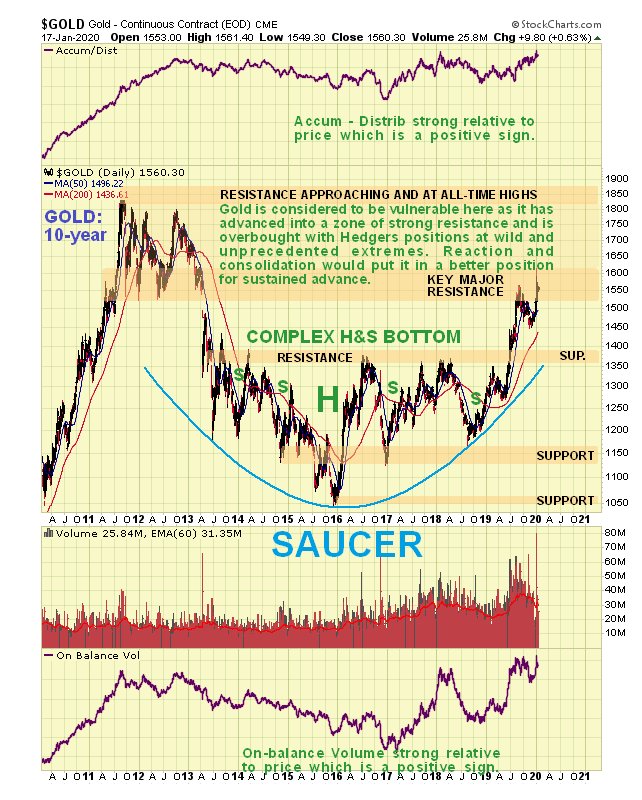
On the 6-month chart we can see how gold stabbed into a zone of strong resistance on the Iran crisis around the time Iran’s General was murdered, but after a couple of bearish looking candles with high upper shadows formed, it backed off into what many are taking to be a bull Flag.
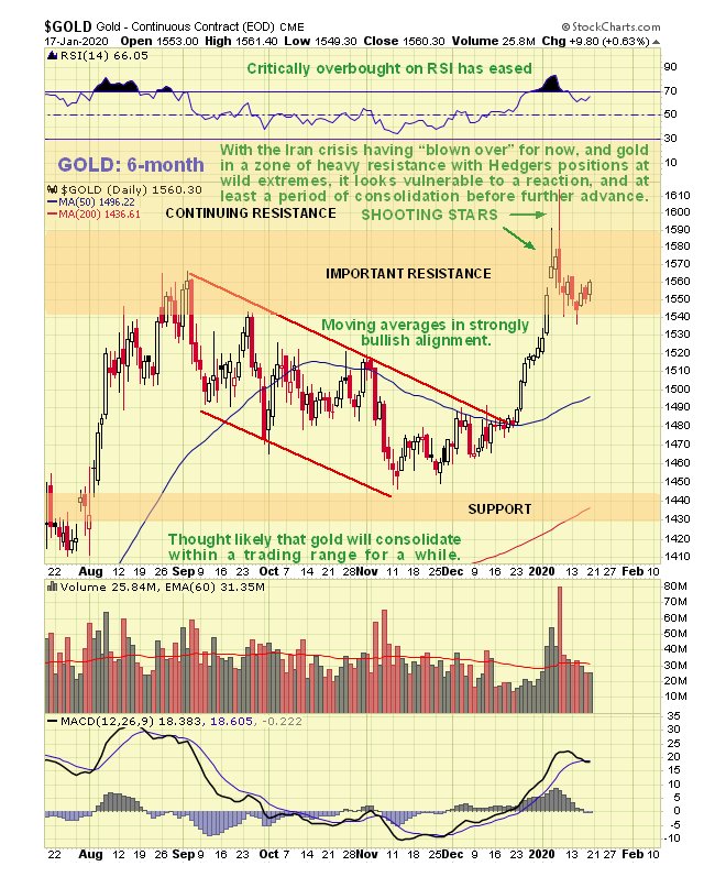
The 10-year chart makes it plain why gold is vulnerable here to
reacting back over the short to medium-term, because it has advanced
deep into “enemy territory†– the broad band of heavy resistance
approaching the 2011 highs, with a zone of particularly strong
resistance right where it is now. It would be healthier and increase
gold’s chances of breaking out to new highs if it now backed off into a
trading range for a while to moderate what now looks like excessive
bullishness.
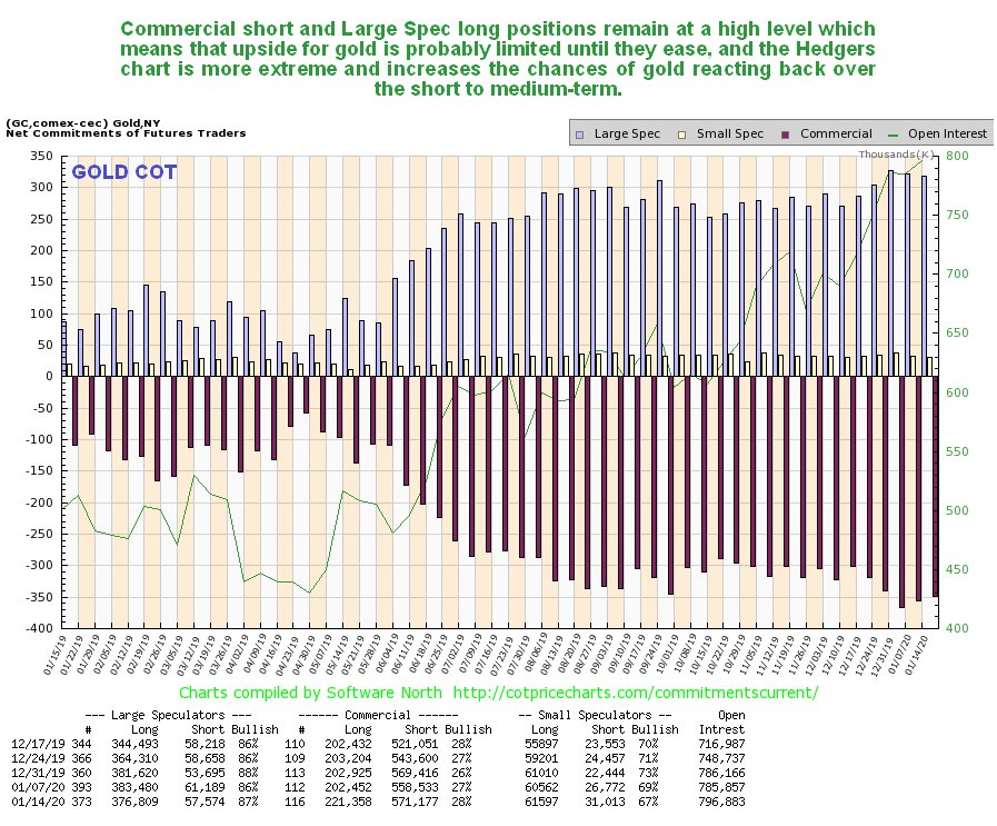
Thus it remains a cause for concern (or it should be for gold
bulls) to see gold’s latest COTs continuing to show high Commercial
short and Large Spec long positions. Is it “going to be different this
time� – the latest Hedgers charts that we are now going to look at
suggest not.
Click on chart to popup a larger, clearer version.
The COT chart only goes back a year. The Hedgers charts shown
below, which are a form of COT chart, go back many years, and frankly,
they look pretty scary.
We’ll start by looking at the Hedger’s chart that goes back to before the 2011 sector peak. On it we see that current Hedgers positions are at extremes that way exceed even those at the peak of the 2012 sucker rally, which was followed by the bulk of the decline in the bearmarket that followed. Does this mean that we are going to see another bearmarket like that – no it doesn’t, but it does mean that these positions will probably need to moderate before we see significant further gains.
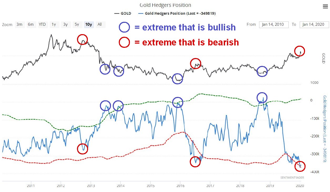
Click on chart to popup a larger, clearer version.
Chart courtesy of sentimentrader.com
Looking at the Hedgers chart going way back to before the year
2000, we see that the current readings are record readings by a
significant margin and obviously increase the risks of a sizeable
reaction. We can speculate about what the reasons for a decline might
be, one possibility being the sector getting dragged down by a
stockmarket crash after its blowoff top, which may be imminent, as
happened in 2008, since it remains to be seen whether investors will
rush into the sector as a safe haven in the event of a market crash.
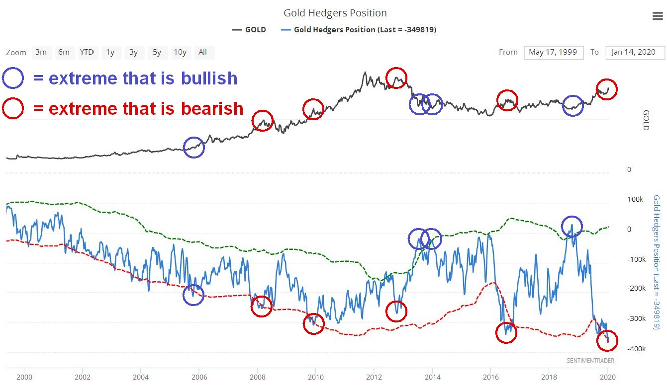
Click on chart to popup a larger, clearer version.
Chart courtesy of sentimentrader.com
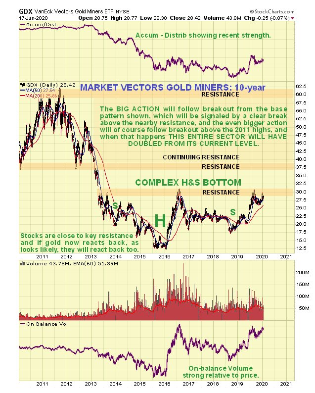
Turning now to Precious Metals stocks, we see on its latest
10-year chart that GDX still looks like it is completing a giant
Head-and-Shoulders bottom pattern. However, it is currently dithering
just beneath resistance at the top of this base pattern, which means
that it is vulnerable to backing off.
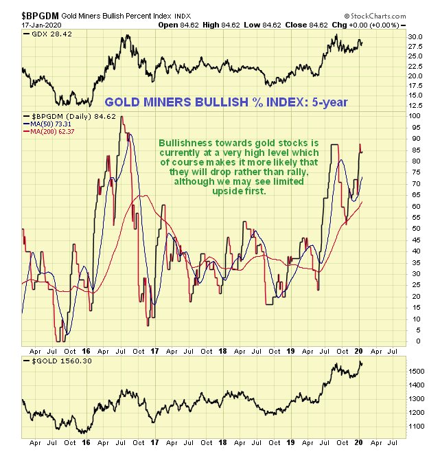
So, how then does gold stock sentiment look right now? As we can
see on the 5-year chart for the Gold Miners’ Bullish Percent Index,
bullishness towards the sector is now at a very high level, 84.6%, which
makes it more likely that stocks will drop soon rather than rally, and
what they could do of course is rally some to increase this level of
bullishness still further, and then drop.
Does all this mean that investors in the sector should suddenly
rush for the exits? No, it doesn’t, especially as the charts for many
individual stocks across the sector look very bullish, and it may be
that all that is needed is a cooling period of consolidation. However it
does make sense to use Hedges at extremes, such as leveraged inverse
ETFs and better still options as insurance, which have the advantage of
providing protection for a very small capital outlay, a fine example
being GLD Puts which are liquid with narrow spreads. We did this just ahead of the recent peak
when Iran lobbed a volley of missiles at Iraq. We will not be selling
our strongest gold and silver stocks, but instead look to buy more on
dips.
SOURCE: https://www.clivemaund.com/gmu.php?art_id=68&date=2020-01-19